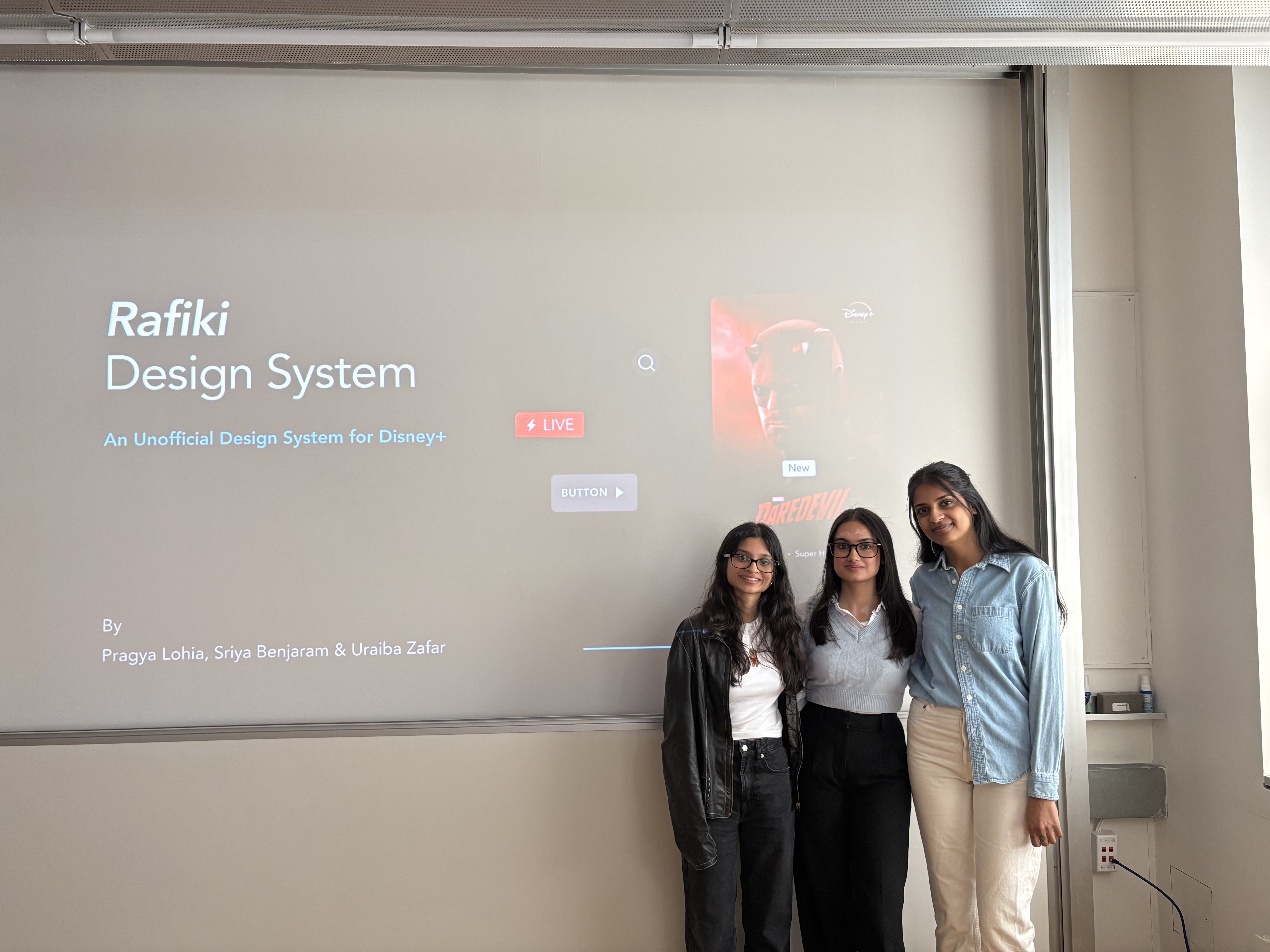
Disney+ Design System
Role: Product Designer, Design Systems Duration: March - May 2026
Overview
Disney+ feels like magic. Rafiki is the system we built to make it last.
As part of a design systems course at Pratt Institute, our team deconstructed the Disney+ interface and rebuilt it into a scalable design system.
Disney+ feels polished on the surface.
But as we audited the interface across screens, a pattern emerged:
Consistency was breaking at scale.
How might we create a system that brings clarity, consistency, and scalability to a complex product experience?
So our team built Rafiki, a comprehensive design system built to make Disney+ accessible, consistent, and scalable.
The Process
1
Deconstructing the system
2
Identifying patterns & gaps
3
Building the system
4
Testing + iteration/refinement
5
Documentation
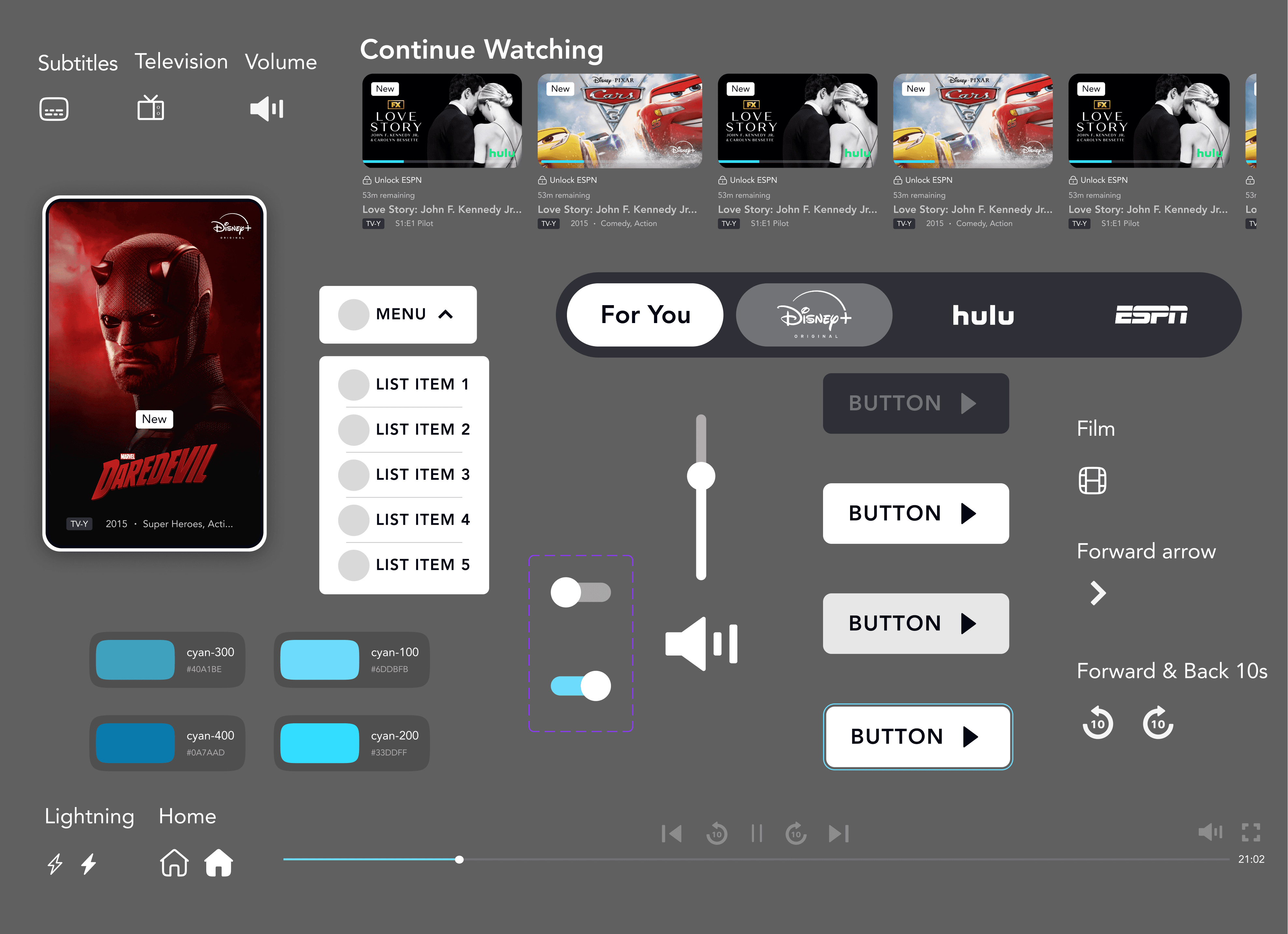
Before we could build the system, we had to break the product down
We began by building a full interface inventory, documenting components across multiple screens.
This allowed us to move beyond assumptions and see the product as a system.
Identifying Patterns & Gaps
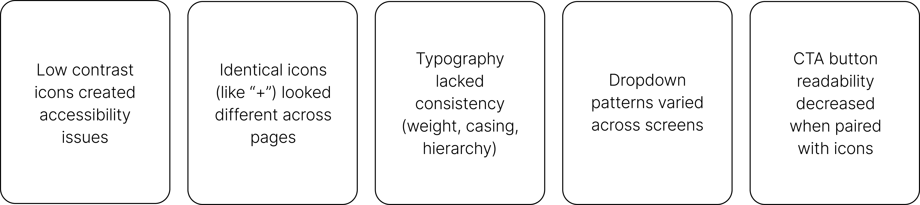
We analyzed the inventory to identify recurring inconsistencies and usability issues.
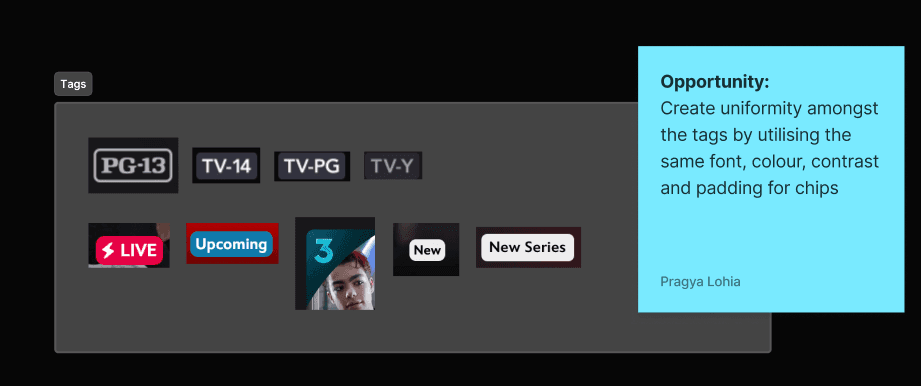
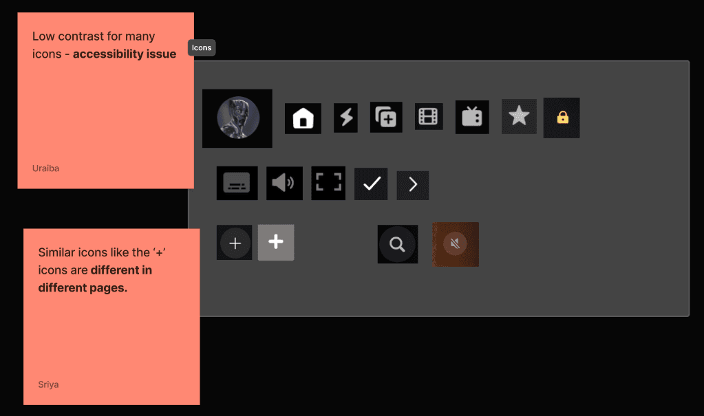
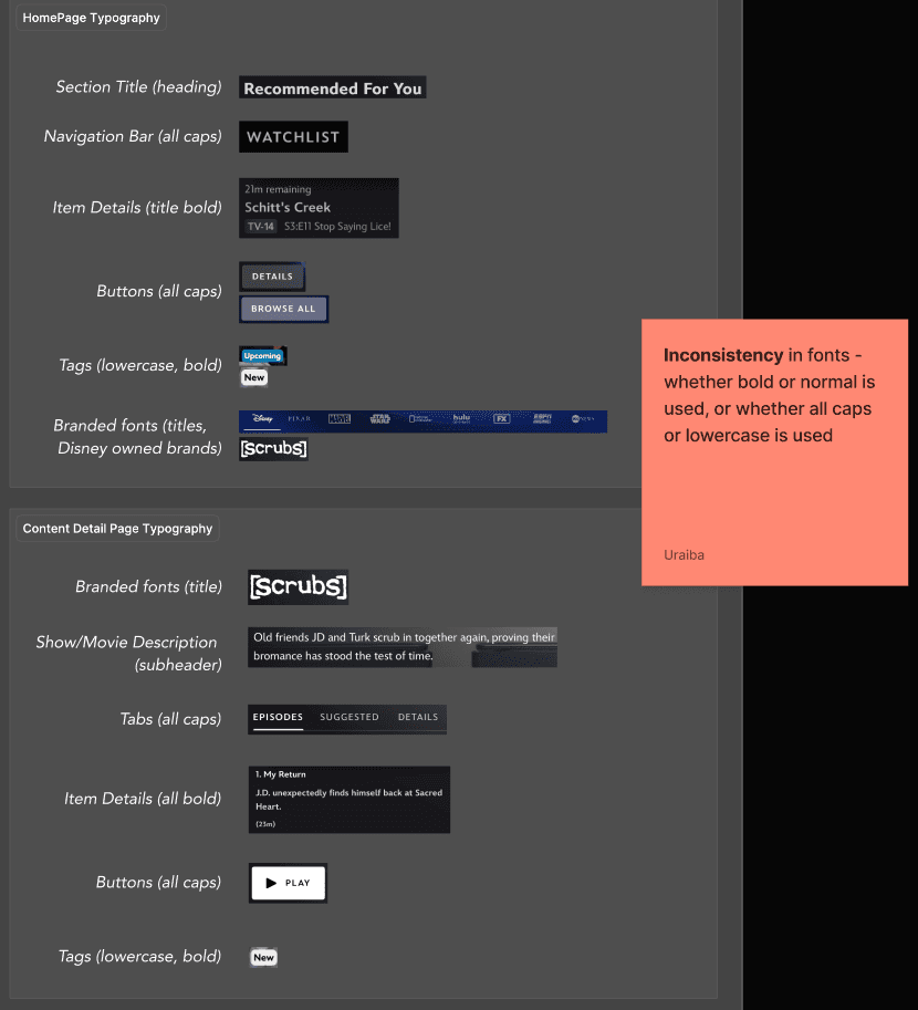
Problem
A seemingly beautiful interface was hiding a fragmented one
Deconstructing the interface into a comprehensive inventory released several key challenges:
Solution
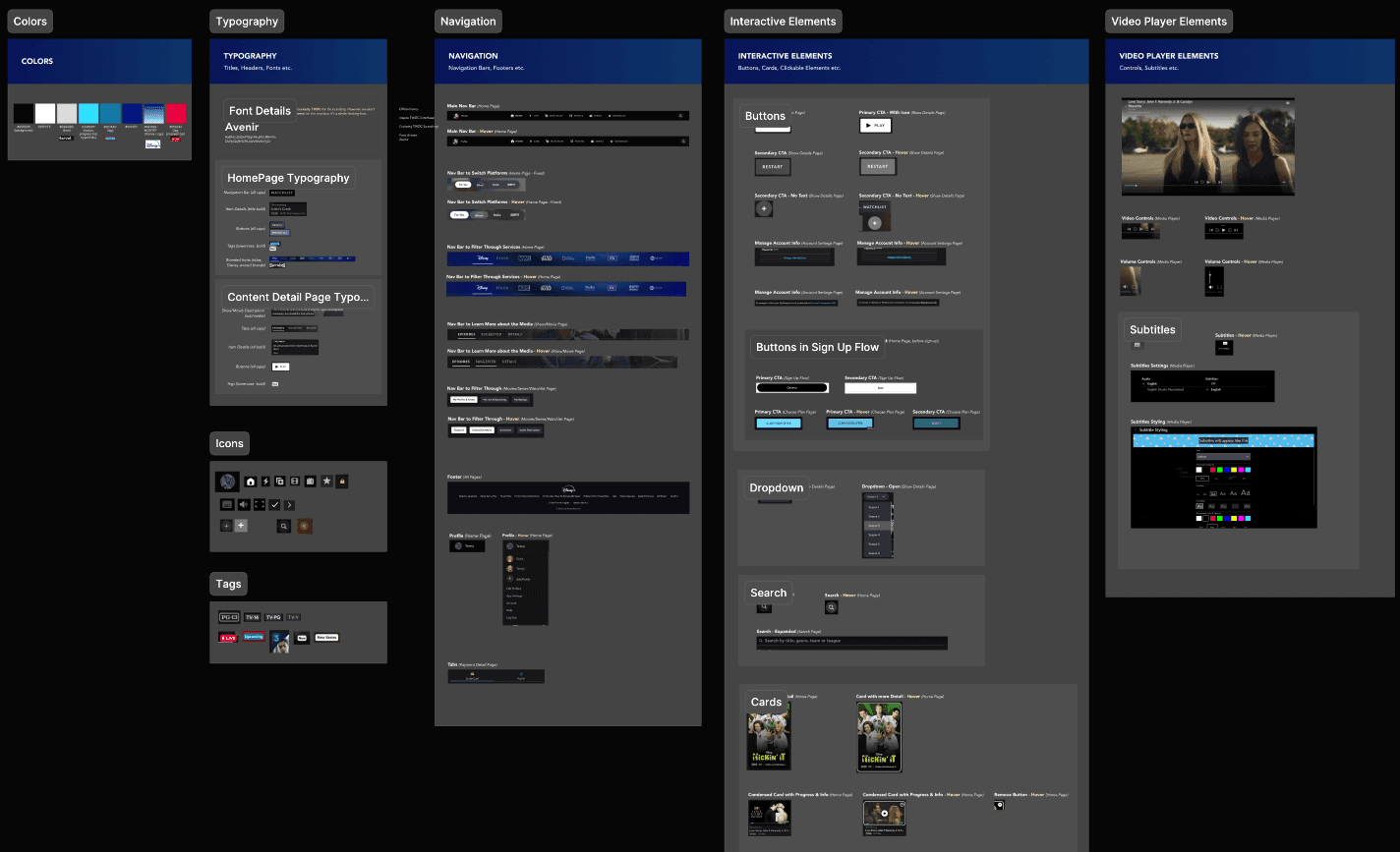
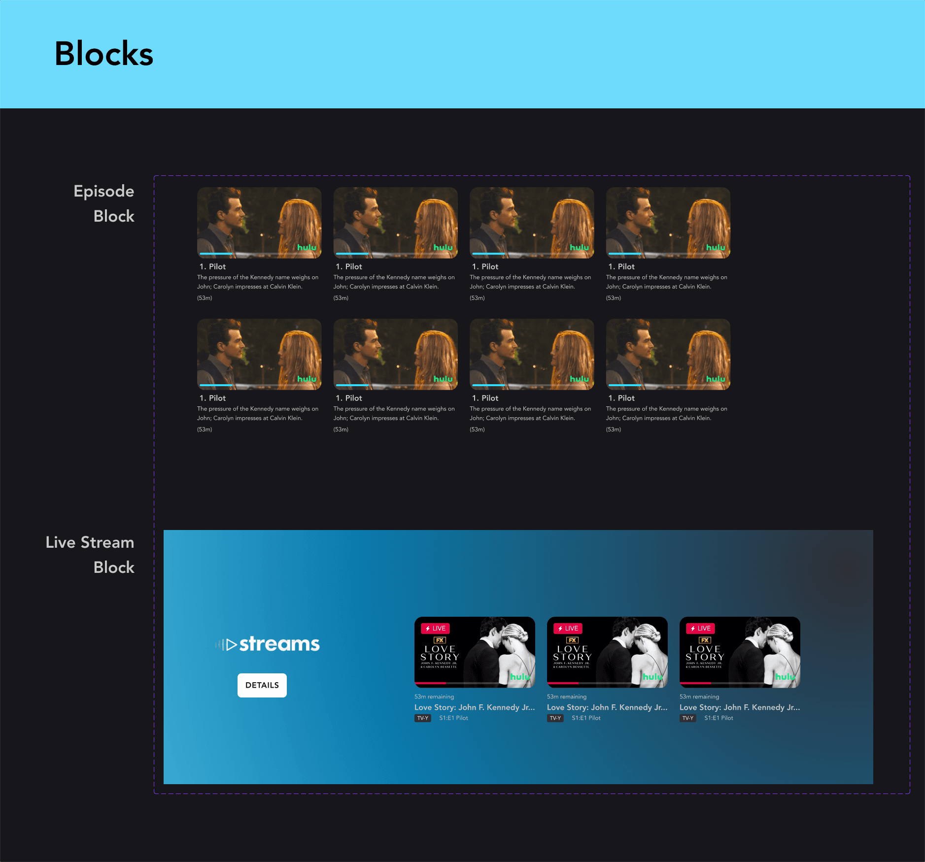
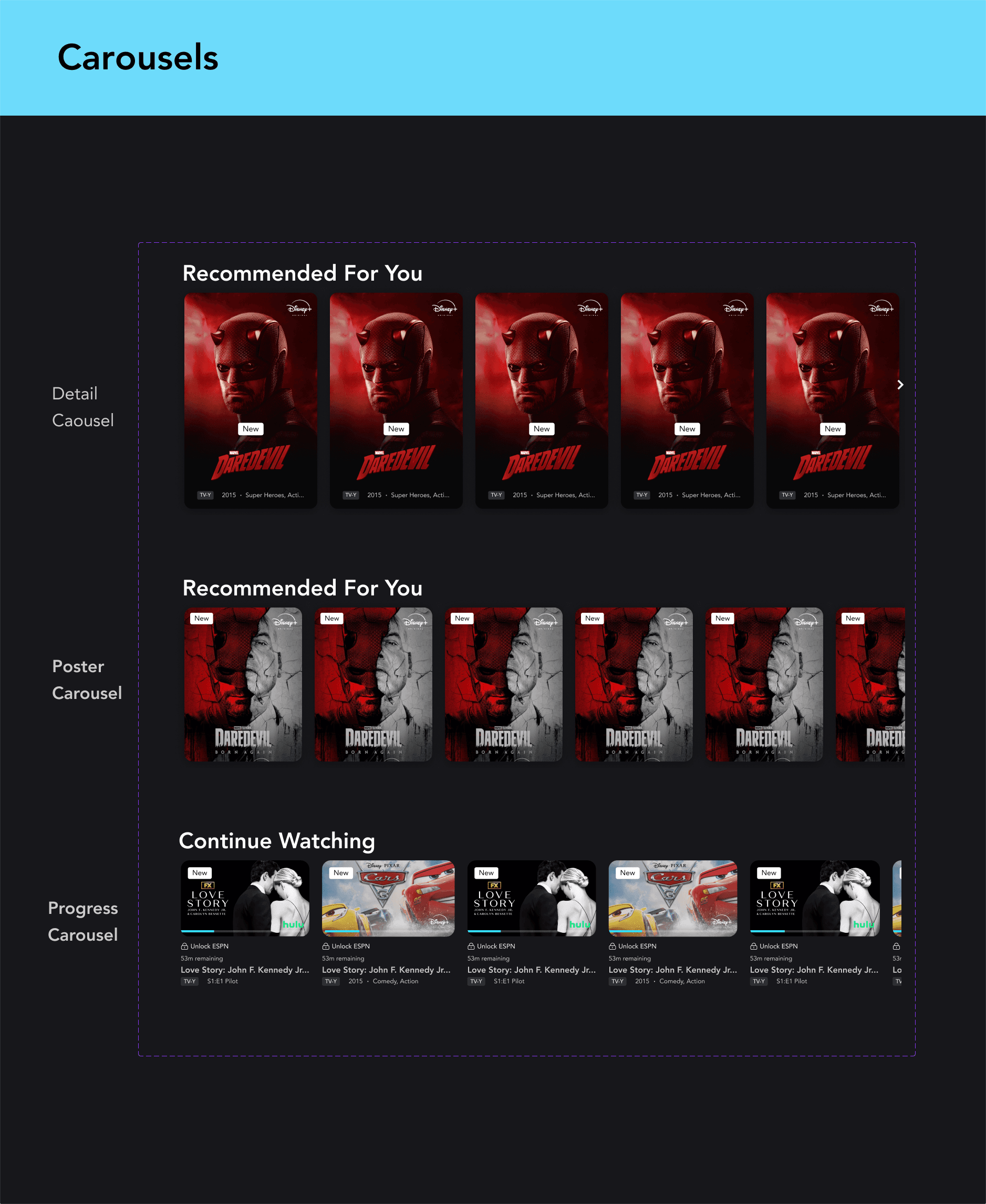
Building the System - Rafiki isn't just a component library — it's a shared language for building Disney+ at scale
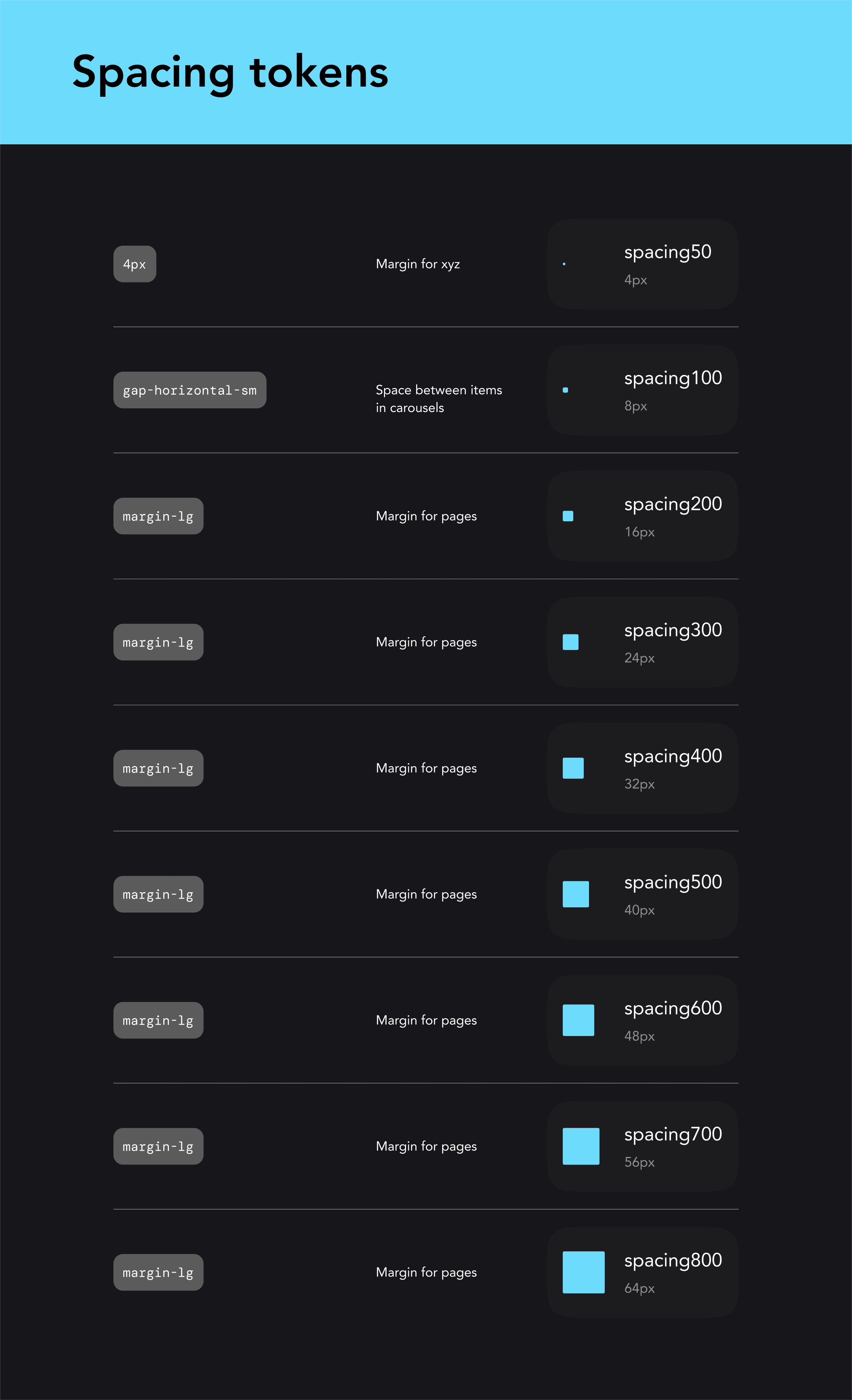
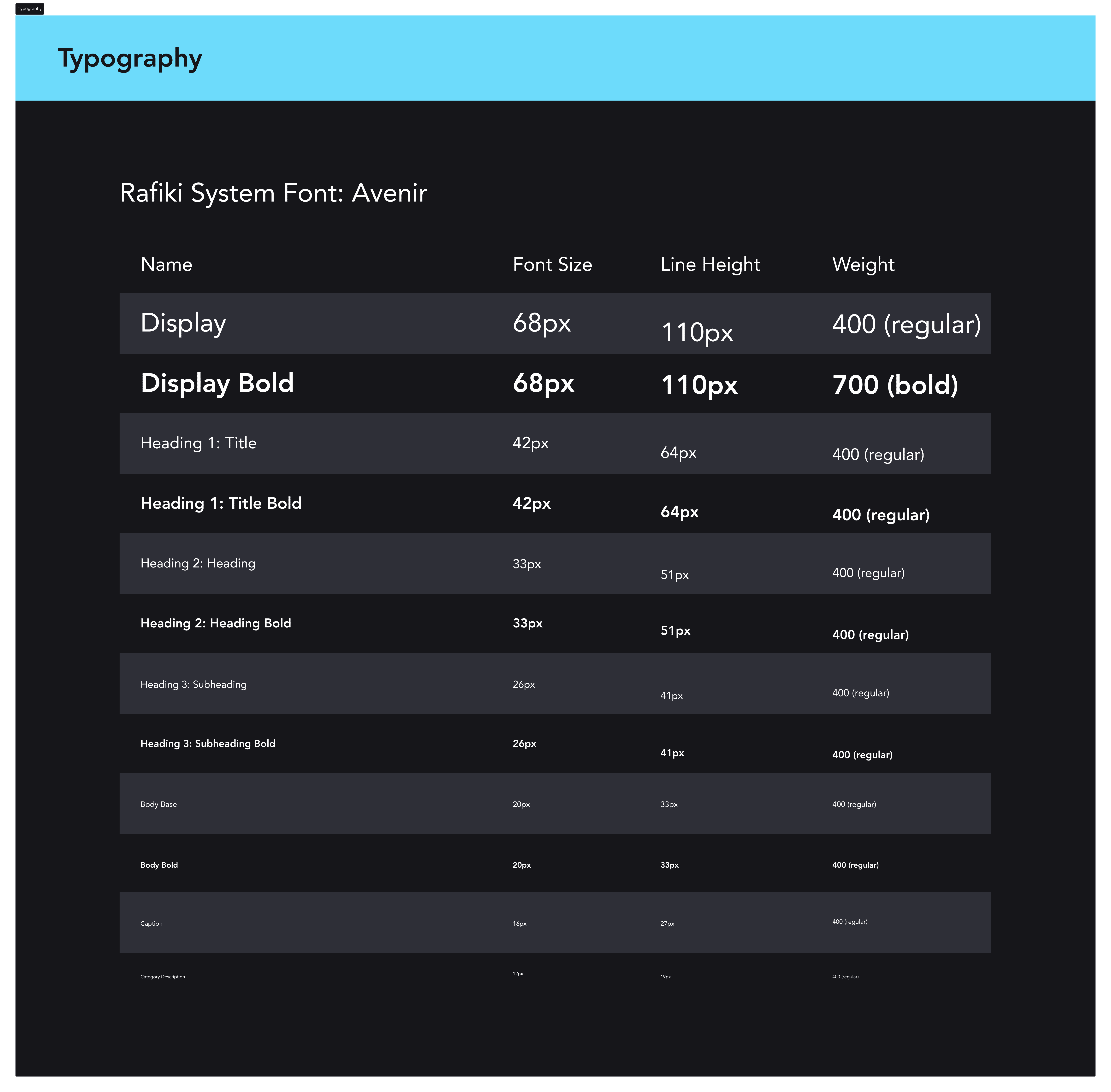
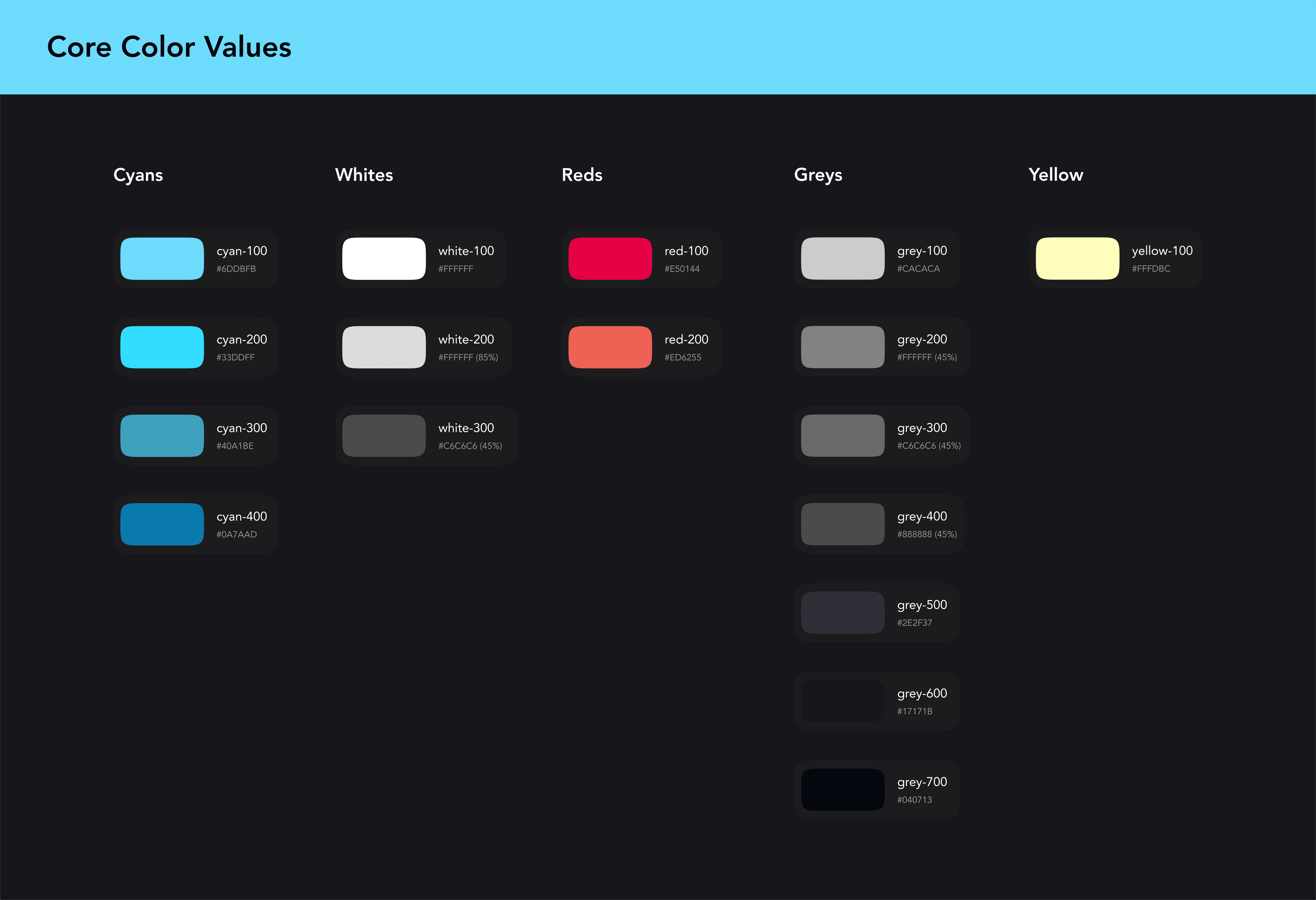
Rafiki is an unofficial design system for Disney+, designed as a guiding framework for consistency, clarity, and scalability. It includes color and typography tokens, reusable components with documented variants, and patterns—all synced to a Zeroheight site that updates automatically with Figma.
Foundations
Clear spacing and layout rules
Standardized typography system
Accessible color tokens
Components
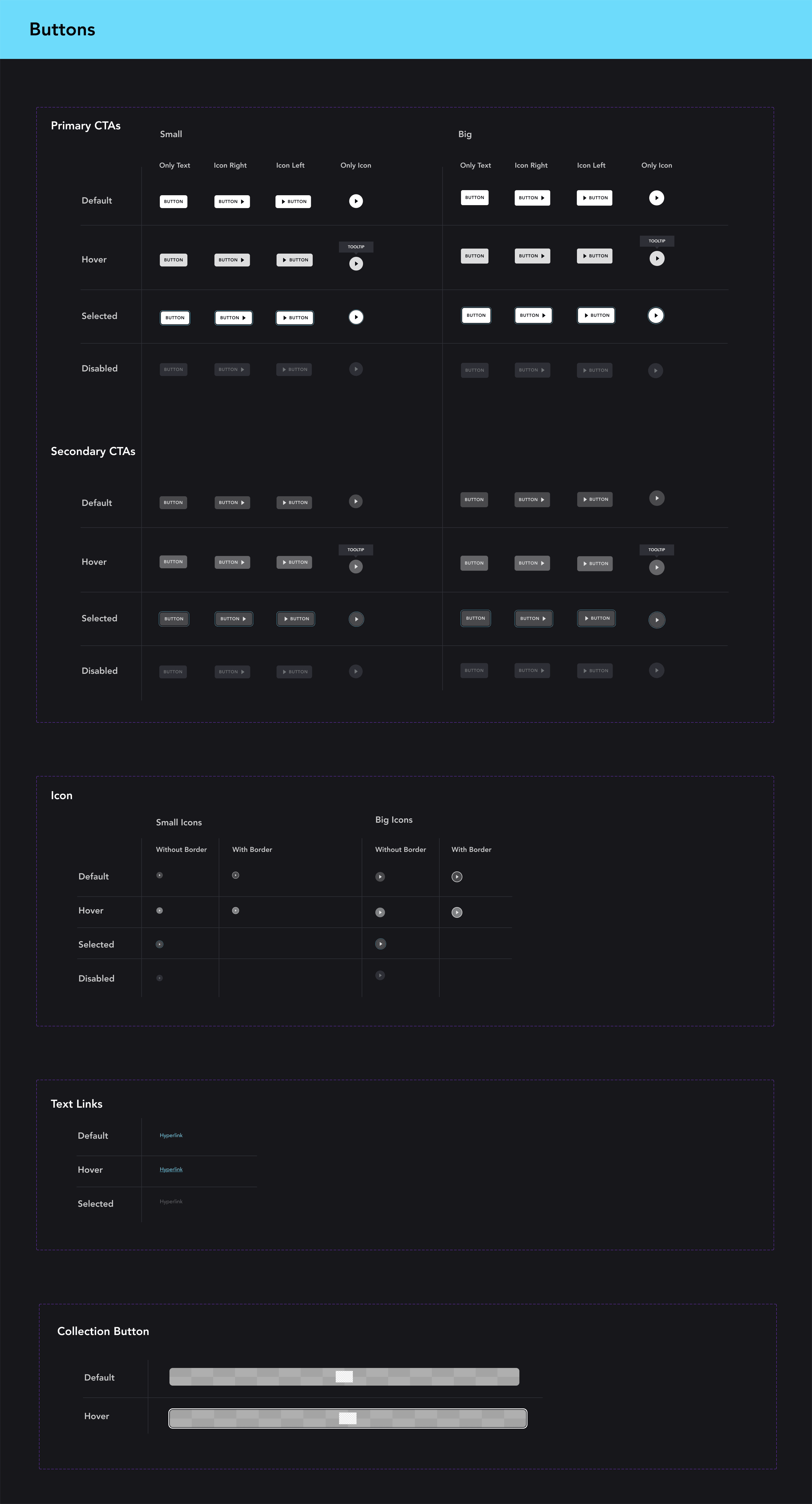
Buttons
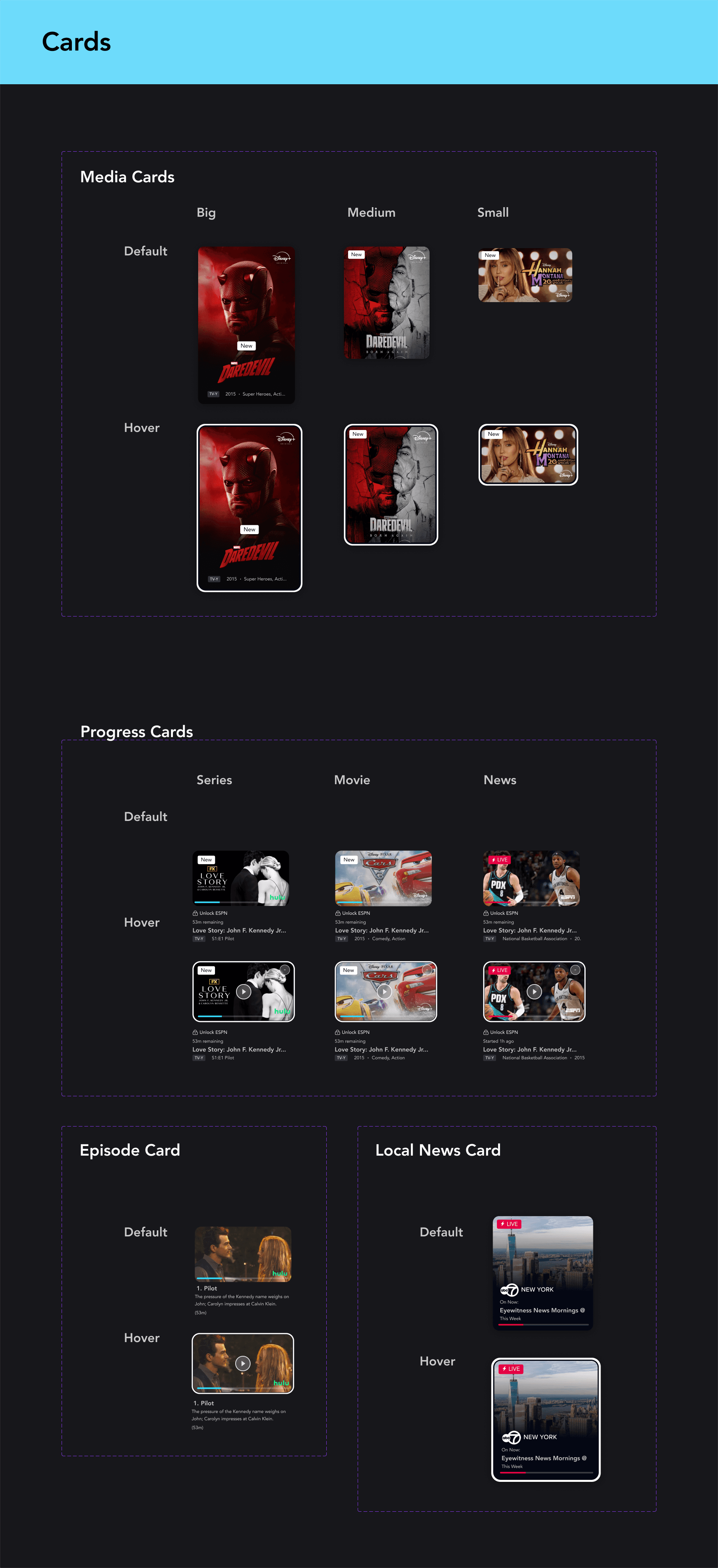
Cards
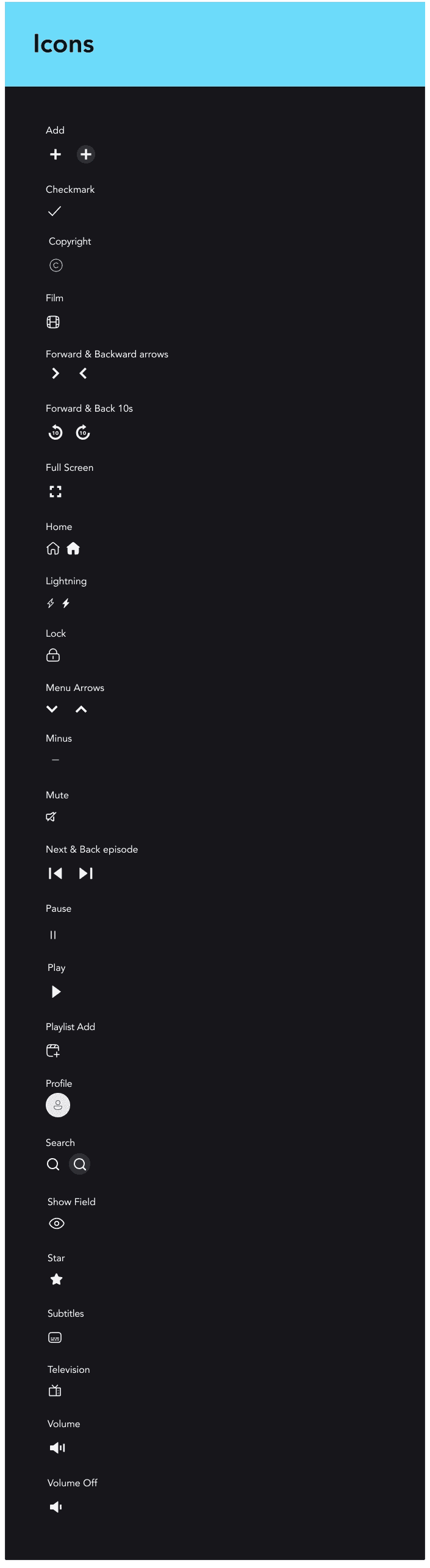
Icons
Patterns
Blocks
Carousels
Navigations

Testing in Context - A design system is only as good as what it produces in someone else's hands
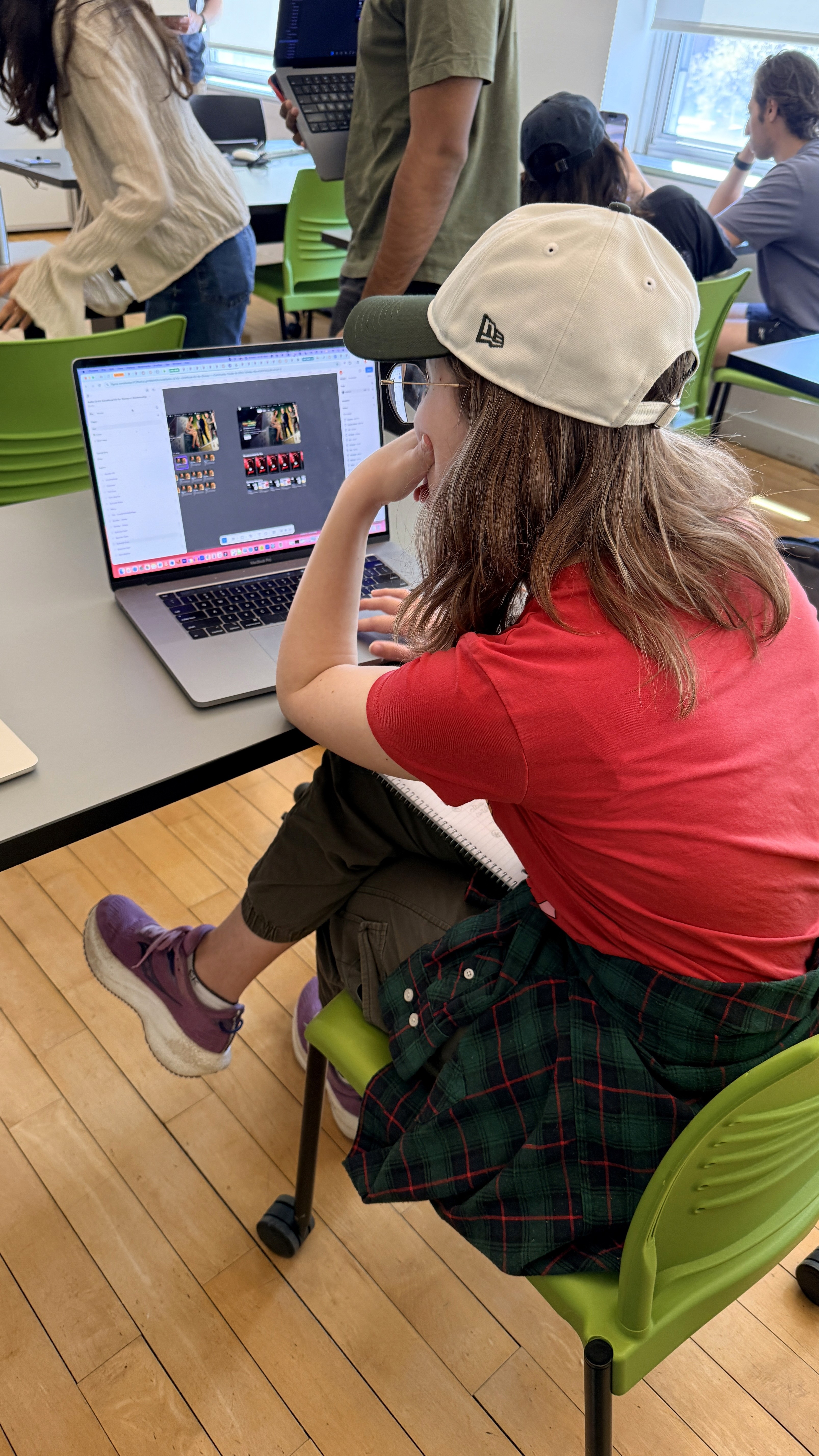
We tested the system by having another designer use our system to assemble two full-page layouts
This revealed a few new issues which we then iterated on and refined:
Inconsistent sizing when components were combined
Missing icons and UI elements
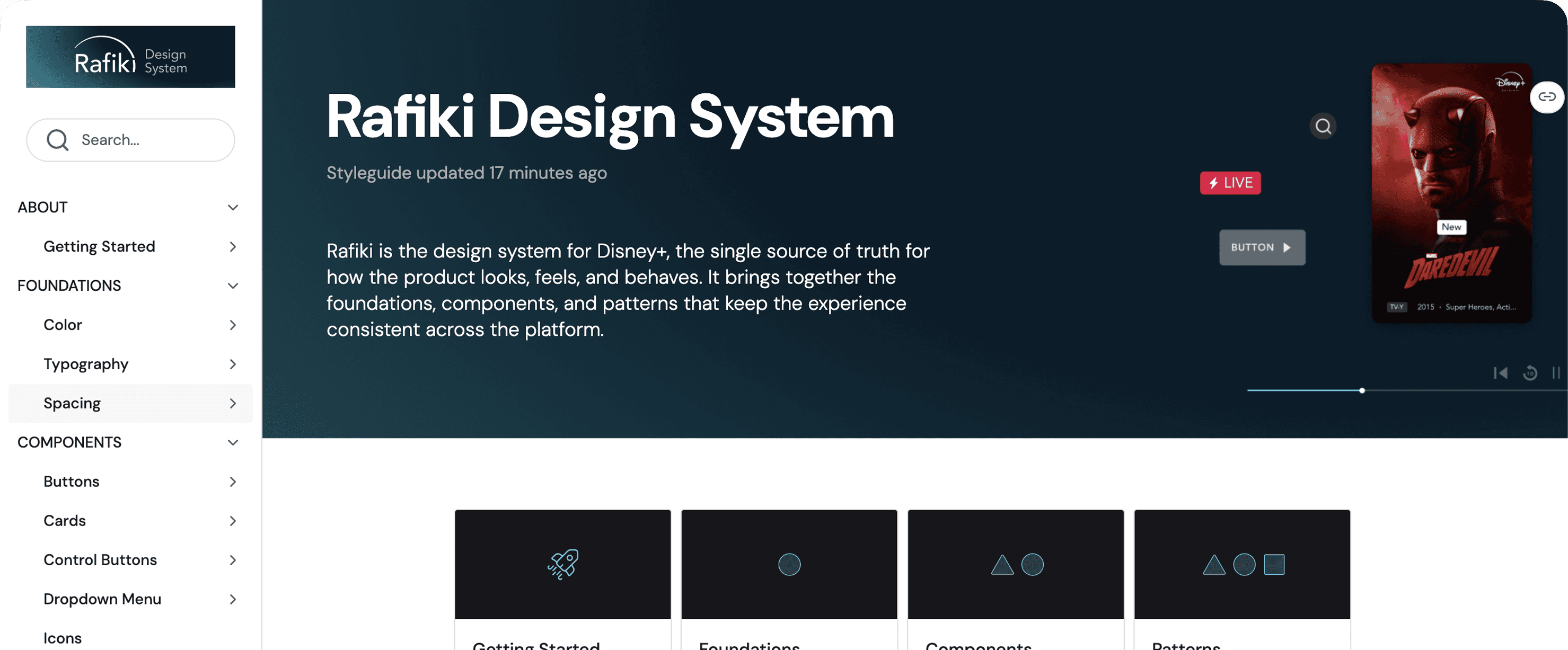
Documentation - A system no one can use is just a folder of pretty files
To support adoption beyond design, we created a live documentation site in Zeroheight.
The site serves as a single source of truth, including:
Component usage and guidelines
Design principles and accessibility rules
Contribution and governance information
Presentation
Presenting to our stakeholders - design students
The final Rafiki design system was presented through a structured walkthrough of the Disney+ experience — beginning with a UI audit of existing inconsistencies and ending with a scalable system of foundations, components, and documented patterns. The presentation highlighted how Rafiki could improve consistency across navigation, typography, iconography, and accessibility while still preserving the cinematic and emotionally immersive qualities of the Disney brand. Supporting materials included reusable UI components, usability testing insights, accessibility evaluations, and Zeroheight documentation demonstrating how the system could scale across teams and future product experiences.
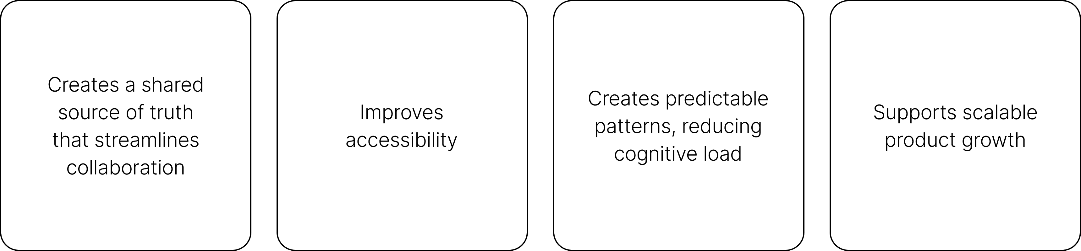
Impact
Rafiki transforms a visually cohesive product into a systemically consistent one
By introducing structure, the system:
Reflection
"Design systems are culture change disguised as a UI kit"
This project taught me that design systems require constantly moving between the details and the bigger picture—zooming into the smallest variables, then stepping back to understand how those decisions shape the entire product experience.
If I could go back, I would spend even more time strategizing and locking in the atoms early. Getting foundations like color, type, spacing, and states solid from the beginning would have made building molecules and organisms smoother, with less back-and-forth later.
The biggest takeaway: design systems are culture change disguised as a UI kit. They don’t just create consistency in the interface—they create a shared language for teams to communicate, collaborate, and build with more alignment.